
USER EXPERIENCE & WEB DESIGN
Trial Experience Redesign
Roles
Project Goals & Development, User Research, UX Design, Visual Design, Implementation
Company: Huntress
Page redesign led to a 4.6% increase in conversion, period over period.
The Problem
The Huntress Trial experience was extremely fragmented, with elements that weren’t aligned to the brand. We set out to redesign the Trial sign-up page, create a new Trial Success Page and resources, and rewrite and redesign the Trial nurture emails.
We wanted to address the following concerns with the Trial experience:
Potential for higher conversion rate on trial registration page
Based on user behavior, it was clear users were unsure what they were committing to by signing up
Content did not provide users with pertinent information
Main value points of the product were not clear
Page did not match the overall site design
The previous version of the Huntress Trial page
Increase trial to paid customer rate
Increase form submission conversion rate on trial page
Make the trial process more self-service and less reliant on 1:1 interaction from Sales
Lay the foundation for iterative approach based on user feedback
Redesign Goals

The redesigned version of the Huntress Trial page
Research & Data Gathering
First, we needed to do research to establish a baseline to grow from and see where we needed to improve the user experience.
We began with these steps:
Gather data and insights on page performance and user behavior, as well as a bird’s-eye view of all trial-related touchpoints
Determine and document performance baseline of existing page
Identify trends and areas of opportunity
Tools used:
Hotjar
Google Analytics
Hubspot

User Flows
Based on my research, I narrowed down to user flows to focus on for the redesign.
The Baseline
15.93%
View to Submission Rate
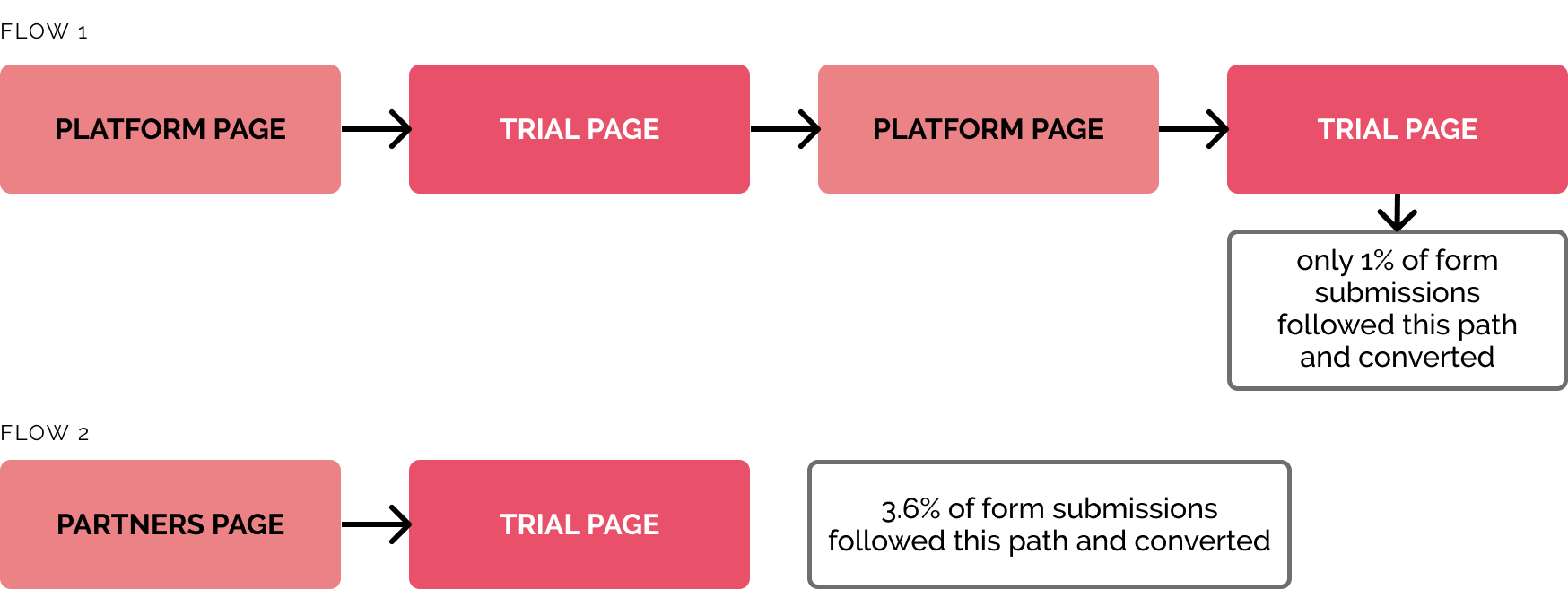
Users were going from the Trial page back to the Platform pages, then back to the Trial page—indicating that they were unsure what they were signing up for.
Areas of Opportunity
Users don’t understand what they get when they sign up for a Huntress trial—how might we make that clear?
We know our users’ pain points—how do we show how we solve them?
A visually consistent experience that’s built for future A/B testing
Ideation
Show users what they are getting when they sign up for a free trial
Show users how Huntress solves their relevant pain points
Not require users to seek out more information before submitting the form
To make sure the team and stakeholders were aligned on the vision, we came up with a list of the items we wanted this new version of the Trial page to accomplish.
Increase accessibility
Load quickly, especially on mobile
Provide a visual experience that is consistent with the rest of the website
Be built for future A/B testing
With these goals in mind, I began gathering design inspiration and best practices.
Visual Design Inspiration
Wireframes
Click images to enlarge
High Fidelity Mockups & Prototype
After reviewing the wireframes with the team, we decided to pursue a few different designs for high fidelity mockups to present to our stakeholders.
Selected Design
Based on feedback from our stakeholders, we selected the final design based on the following included components, which aligned with our goals:
Top 3 value propositions that correspond to common pain points
Form sits higher on the page
Company and platform statistics to instill trust and establish credibility
Visual contrasts in header and value points for better accessibility
Social proof in the form of a partner testimonial video
Short, clear description
Visual of what is included in the trial
Mobile-optimized design


With the selected design finalized, I built the initial version of the page for desktop and mobile in the Hubspot Designer. Once the page was live and we began collecting data, we finetuned and updated components of the page as needed.
Prototype


Other Touchpoints
We realized users who submitted the trial registration form were being redirected to the platform login page with no immediate instruction. We decided to create a new Trial Success page that users would be automatically redirected to once successfully completing the form.
After Registration

Our initial version contained a downloadable PDF datasheet with instructions on how to make the most out of the 21 day free trial.

We later added an animated video summarizing the trial tips to the page so users had a quick start video to watch right after signing up.
The creation of this page and related resources helped accomplish our goal of making the trial process and onboarding less reliant on the Sales team, and more self-service.
During the Trial
Trial users had always received a series of nurture emails, but they were dry, overly technical, and not reflective of the Huntress brand personality.
The emails were completely reworked and rewritten with updated information and feedback from stakeholders.
I designed and coded the new nurture emails in HTML so that they could be deployed from a non-Hubspot email service.


Outcomes
Did the new Trial page and experience accomplish our goals?
Rate held steady
Increase trial to paid customer rate
Average view to submission rate climbed to 21%, a 4.6% increase in the conversion rate
Increase form submission conversion rate
Created Trial Success page, quick start video and PDF guide
Make the trial process more self-service
After setting baseline for redesigned page performance, started regularly A/B testing
Lay the foundation for an iterative approach based on user feedback
4.6%
Increase in conversion
21%
Average View to Submission rate
Acknowledgements
This project would not have been possible nor successful without the support and work from the following people:
Brandon Garcin, Director of Brand & Content | Stakeholder management & support
Rachel Bishop, Marketing Strategist | Copywriting & editing
Audane Leger, Digital Marketing Manager | Website implementation & testing
Bryan Sarmiento, Senior Animator & Producer | Video animation & production